What’s the point of this project?
The Our Budget project came from a mix of necessity and, well, a bit of over-engineering. After moving in together, my partner (now wife) and I wanted to keep track of our shared expenses. In the first year, we used a simple Google Sheet to monitor key spending categories: Income, Rent, Utilities, and Credit Card spending. While this gave us a decent monthly savings overview, it didn’t do much to break down where we were actually spending our money. Naturally, we wanted to fix that!
There are a few solid budgeting apps out there, but we weren’t excited about sharing our financial data with third-party services. A more complex spreadsheet could’ve been an option, but building our own app gave us a fun challenge—and full control over the features we wanted. So, I turned this into a side project!
The Tech Stack
The Core: Next.js and TypeScript
The app’s core is built on Next.js, primarily because of the project timeline. I wanted to get this up and running before the end of 2023, so we could start using it for all of 2024. With a week off before the new year, I figured it was the perfect time to knock this out.
Next.js was a great fit, as it simplifies a lot of complexity under the hood, and offers a developer-friendly experience, making it easy for a solo dev to bootstrap something in a short amount of time. Its built-in features like API routes and file-based routing also allowed me to focus more on business logic and less on setup.
Additionally, its SSR (Server-Side Rendering) and Server Action capabilities offer great performance out of the box, making it easier to handle larger datasets or more complex functionality in future iterations of the app.
Authentication: Clerk
There are plenty of ways to handle OAuth these days. I chose Clerk for a couple of reasons:
- I wanted to try a new solution for authentication.
- It’s a quick, simple way to manage users so I could focus on building the core app.
Currently, the app is on Clerk’s Hobby tier since it only has two users. But Clerk makes it easy to scale up, with plenty of extra features available in the paid plans. For larger applications, Clerk offers comprehensive user management tools and APIs, which can be leveraged for things like multi-tenancy, role-based access control, and more advanced user analytics.
Database: Postgres and PrismaORM
I initially used PlanetScale’s hobby-tier database, but when they phased out their free tier in April 2024, I migrated to Neon’s hobby-tier. The migration was smooth, and I’ve been really happy with Neon so far. Both platforms offer features like branching and connection pooling, which are essential for scaling apps in the future.
While I enjoy writing raw SQL, I opted for PrimsaORM due to time constraints. Prisma offers strong type safety, which pairs perfectly with TypeScript, helping avoid potential runtime errors. It also provides an intuitive migration system, making it easier to evolve the database structure as the app grows.
For this project, I focused on keeping the schema clean and minimal, but the ORM’s flexibility means I can extend it with relations or more complex queries if we ever decide to expand this project.
UI/UX: TailwindCSS and MantineUI
The first iteration of the project used just TailwindCSS since the interface was mostly simple forms and tables. By Phase Two, I added MantineUI to give the app a more polished look and a better user experience.
TailwindCSS allowed me to quickly prototype layouts without getting bogged down in specific styling details. Once I was ready to improve the UI, MantineUI helped speed up development by offering pre-built, customizable components that ensured consistency across the app.
If this project were to scale, Mantine’s design system would allow for rapid feature development while maintaining a cohesive visual identity.
Exploring Our Budget
So, what does the app actually do? There are four main parts to Our Budget:
- Activities
- Categories
- Payment Methods
- Dashboard
Activities
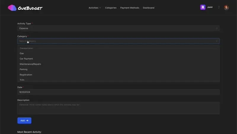
We wanted to track spending down to the transaction, and that’s where the Activities section comes in. Whenever a purchase is made, we log it through a simple form that captures key details like category, payment method, date, and more.
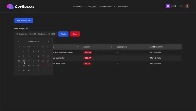
The Activities table gives a broader view of all logged spending, with options to filter, sort, and dive into specific transactions.
Each activity can be edited or deleted from the individual view.
Reimbursements
After a few months of use, we realized we needed better tracking for reimbursements. For example, if we split a gift with friends, how do we track getting paid back?
Initially, I added a “Reimbursement” activity type, but it was hard to link reimbursements to specific activities. To fix this, I introduced a Reimbursement Table.
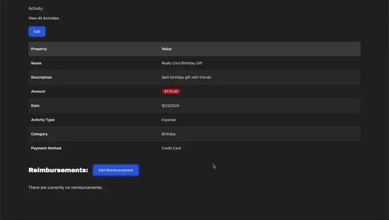
This table associates reimbursements with specific activities. Now, when a user logs a reimbursement, it updates the original amount and provides a clear view of what’s been reimbursed.
Categories
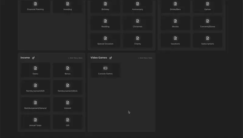
The Categories page helps track spending in custom categories, giving us a better understanding of where our money goes each month.
Categories are split into Parent and Child categories. Parent categories group related expenses, making it easier to organize when selecting from a dropdown. Child categories are where the actual spending is logged.
You can add, edit, and delete categories. Note: you must delete all child categories before removing a parent category.
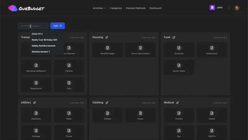
When creating or editing child categories, users can pick an icon (just for fun!) and name it. If you try to delete a category with associated activities, the app prompts you to reassign those activities first, using a database transaction to ensure everything updates smoothly.
Payment Methods
Payment Methods are similar to Categories, but users can’t create their own parent categories. This is because these are tied to predefined Activity Types. I kept this locked down from the start, since most activities boil down to two things:
- Money coming in
- Money going out
I also added a “Big Expense” activity type for large purchases (like a car down payment). The idea here is to filter out these big expenses in the dashboard to keep monthly spending metrics more accurate.
Dashboard
The Dashboard is where users can see their spending broken down by category, with the option to filter by date range. I have a long list of planned features for this page, including:
- Charts
- Detailed insights for specific categories
- Custom goals users can set
Conclusions
Overall, this has been a fun side project. While it’s not overly complex, it’s solved a real problem for us. Now, my wife and I can easily track our spending and view the data on any device.